
By Bob Bonett
Sticking out in a colorful blaze of blue and gold, a system of labeling buildings was recently introduced onto the University campus to help students and visitors locate residential and academic buildings. While the signs appeared in an effort to modernize the campus and make it more student-friendly, an anti-sign sentiment has grown markedly among the student body.
The catalyst for the spread of unfavorable sentiments was a group created on Facebook.com. The Web site hosts a group entitled “Hofstra University Is Not a Theme Park,” a playful jab at the size and design of the new signs.
“The most recent attempt to modernize [the look of the school] has left Hofstra’s campus torn between sophistication and run-of-the-mill pop art,” reads the group’s description. “Further, we support the restoration of Hofstra’s culture in general. This regards such issues as Hofstra’s modern logo, and any others that require attention.”
Created on Oct. 2, the group already had 1,148 members as of 4:11 p.m. Oct. 4. On Wednesday, Oct. 10, membership reached 1,439 members.
The group’s founder, Mike DiNicola, a sophomore psychology major, explained his rationale for creating the group.
“I don’t even claim to know the ins and outs of the University’s history, but I do know that there is a history there that didn’t just spring up overnight,” DiNicola said. “I’ve had this feeling that Hofstra was abandoning its identity,” he said, referring to the new school logo, “and now these signs appear.”
According to Melissa Connolly, vice president for University Relations, the project-a multi-year effort expected to include vehicular, directional and pedestrian signs-was funded by a grant from the Town of Hempstead, operational funds and a special grant assigned by Sen. Charles Schumer (D-N.Y.).
“We’ve received some mixed reactions, but some think it’s great,” Connolly said. “It makes the buildings more accessible and more identifiable and will help new students to find buildings.”
Student members of the online group did not condemn the University as it was before the installation of the signs. “I’ve always felt that Hofstra’s campus was a beautiful place,” DiNicola said. “The architecture, art, plants and flowers all blend so nicely.”
DiNicola said he feels the University should uphold some of its history in its appearance. “I wouldn’t consider myself a traditionalist by any means,” he said. “It is definitely about a respect for Hofstra’s culture and its appearance, both physical and ideal.”
The signs display buildings names underneath the University logo. However, many of the signs, including the one in front of the Law Library, are partially blocked by bushes or flowers, further adding fuel to the students’ anti-sign fire and bringing about complaints that blue plastic is out of place when contrasted with the beauty of nature.
“I think they are necessary in terms of convenience and helpfulness, but the design of them is out of place,” Peter Greis, a sophomore business major, said.
Greis felt that a different approach toward the campaign may have been more effective. “They need to fit in with the theme of the rest of the campus more; maybe a brick sign that blends in with the general building plans.”
DiNicola also offered his opinion as to the direction the project could have taken.
“The etched lettering on most of the buildings was appropriate in my eyes,” DiNicola said. “I noticed when I was taking a picture of the sign for the Hofstra University Museum that there is also a plaque placed on the archway there; blue with white letters. I think that would be perfect for every building on campus. It’s simple, and doesn’t detract from the building’s aesthetic qualities at all.”
The project is scheduled to be completed in three years.
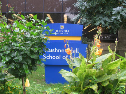
A sign outside the Kushner Hall School of Law is partially blocked by plants, adding to the negative student sentiment. (Julia Gardiner)