Hello everyone! Welcome to Tino’s Jersey Reviews!
In our last review things got heated between me and the Indianapolis Colts organization. I reached out to them for comment, still waiting for a response. If you missed that one go check it out! For our fourth review, and second AFC team… let’s review the Cleveland Browns.
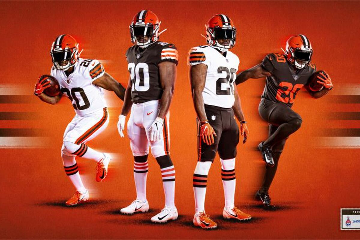
First thoughts: Well, well, well… the moment we have all been waiting for is here. The Cleveland Browns have changed their uniforms. We all knew this was coming after they decided to release that absolute monstrosity of a uniform back in 2015. Now, I will say, I commend them for trying. Many teams never take the risk to switch things up as drastically as the Browns did. But the way they did it made them look (and play) like a college or high school football team. Now that I think about it, my high school football team had the same exact uniforms as the Browns, with the name on the front and stripes on the sides and down the pants. Interesting.
So far, I have heard mixed reviews from the people: Some think it’s questionable, and some think it’s a step in the right direction. I have to take both sides here; it’s a move the Browns had to make. For all of the 2019 season, they made their all-brown uniforms their primary home look, just because the other options were so bad.
“As you look at iconic franchises like the Browns, the [Chicago] Bears, the [Green Bay] Packers, the [Dallas] Cowboys – they’re true to who they are. They’re not doing a lot of changes and trying to make a lot of flashy moves with their uniforms,” said executive vice president and Browns co-owner J.W. Johnson in a statement. “I think when we went through the process, it just felt right that we got back to who we are and who we’ll always be.”
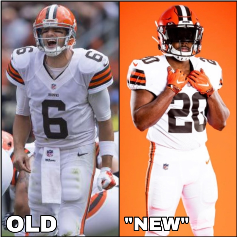
Here is the problem: The new Browns jerseys are not new. They are old jerseys brought back for a new team and generation. We have seen this move many times, with teams like the Jacksonville Jaguars adopting half-gold, half-black helmets and an obnoxious uniform color combination, then changing back to a similar design and keeping colors that fit. Or with the Tampa Bay Buccaneers, who tried to evolve but sadly failed with their bright orange and red colors. They went back to the original concept, threw in a nice dark grey alternate and everyone was happy!
So I get it, Browns. You thought you could pull off the same maneuver and I wouldn’t notice. Do you know who I am?
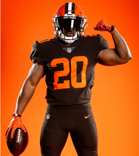
While it was the right idea, the lack of effort really frustrates me here. The Browns had to fix the poor decision they made, so they just went to the exact same uniform that worked well last time. No tweaks, no changes. I mean, can I at least see some stripes on the all-brown alternate pants? Those are just too plain.
With all of that being said, my job here is to review the jerseys, so that is what I’ll do. I really like the all-white, but to have that as your standout option is never a good thing. I would like to have seen some orange pants to go along, just for some options to add to the collection. The organization wanted to represent the history of the Cleveland Browns, and I think they did that well. The striped socks are another thing that is unique and connects well with the striped pants, but they lost me with the all-brown look. Like, why? Look at it. Put Cleveland on the front, or a “dawg pound” logo on the sides, maybe even a white outline for the numbers… anything!
Let’s get on to the review: A bad alternate look, no effort shown to change anything at all, but better than the most recent design…
Tino’s Rating: 6.2/10
The Browns got lucky here. These are not better than the new Buccaneers uniforms, nor the Jaguars jerseys. But with that being said, they did make the necessary changes to get rid of the last uniforms’ ugliness. One thing is for sure, though: These uniforms are way better than Baker Mayfield’s performance last season.
Photos courtesy of the Cleveland Browns and Bleacher Report



Nick Gambino • Apr 18, 2020 at 8:46 pm
The Cleveland Browns are a dumpster fire! The previous uniforms they wore were absolutely terrible, these are way to plain but definitely less repulsive than the old jerseys. They need more options. Baker Mayfield has more progressive insurance commercials than the Browns have uniform options. My rating: 4.6