Hello everyone! Welcome to Tino’s Jersey Reviews!
This is a series where I review the latest jerseys being released for the National Football League (NFL) teams who are trying to change it up, start a new trend, or are just confused (the Browns). Seven teams are slated to bring change to their previous looks before the 2020 season starts in September. Reviews are unbiased and graded on a scale of 1-10 (10 being the best), so without further ado, let’s see the goods!
The first team who has released a new look for this season is the Tampa Bay Buccaneers.
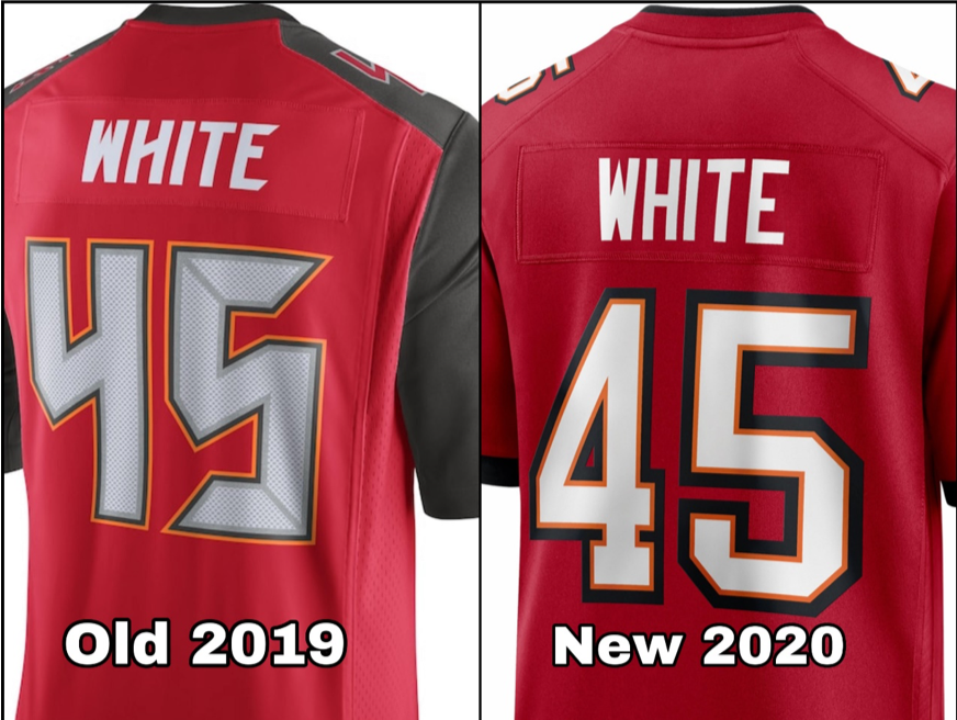
The Bucs went for the traditional look here, sort of reminiscent of what we saw up until 2014. I can’t blame them either; in a world where fanny packs and mullets are back in style, teams are afraid to create major change. Getting rid of those ugly alarm clock numbers and replacing them with the proper football number style font also was a much-needed change.
A new uniform is not the only thing that Buccaneer fans have to look forward to for next season, though. Yes, that’s right! Chris Godwin changed his jersey number!
But on a serious note, unless you’ve been living under a rock for the past few months, you probably know that Tom Brady left the New England Patriots after 20 seasons to sign with Tampa Bay.
With Brady in and Jameis Winston out, I think this change is the right move to make. The uniforms themselves come off as a lot more mature. Going with the darker shades of red and orange-red and ditching the bright orange piece on the upper sides was smart.
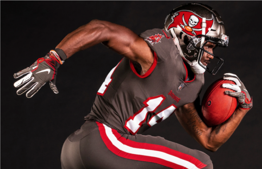
I can see them winning games in these. Heck, if Tom Brady wants, they’ll go to the Super Bowl that will be played in their home stadium and win in these. Along with the red home and the white away looks, they have also released their third color rush option that is an all-pewter look. I’m going to be honest and say I did have to google what “Pewter” was – it is the color dark grey. Now that we have that out of the way, I’d definitely say this is a great option to have. Under the lights, a player in pewter looks like a pirate on his Santa Maria firing cannons at oncoming rivals.
“This new but familiar look is a direct result of the valuable feedback we received from our fans,” Buccaneers co-chairman Edward Glazer said in a statement. “We are excited to return to our classic Super Bowl-era uniforms while also introducing a sleek Color Rush uniform that showcases our signature pewter in a new and dramatic way.”
Okay, enough pirate talk. Let’s get on to the rating.
A nice dark red, a sleek white away… It’s fashionable to wear, and they went back to traditional…
Tino’s rating: 6.5
A 6.5 is not a bad start to this review series. I appreciate the Bucs’ thought process here, but I was a little underwhelmed by the traditional look. It wasn’t bad, but it didn’t pop out to me as a new revolutionary culture change in Tampa. But hey, maybe that is what Tom Brady is for.
Photo Courtesy of the Tampa Bay Buccaneers


Nick Gambino • Apr 11, 2020 at 1:05 am
Love the Pewter look! Definitely agree that this is ringing in a new, more mature era of Bucs Football with Brady coming in too. These remind me of the old Bucs uniforms worn when they won a Super Bowl in the early 2000’s. I’m not even a Bucs fan but I’m thrilled Godwin changed his number, biggest news of the entire offseason