

Tino's Jersey Reviews: Atlanta Falcons
Hello everyone! Welcome to Tino’s Jersey Reviews!
In the last jersey review, we talked about the Tampa Bay Buccaneers getting new looks for this upcoming season. If you haven’t already read that one, go check it out! In this review we are actually staying within the NFC South Division. Let’s review the Atlanta Falcons’ new jerseys.
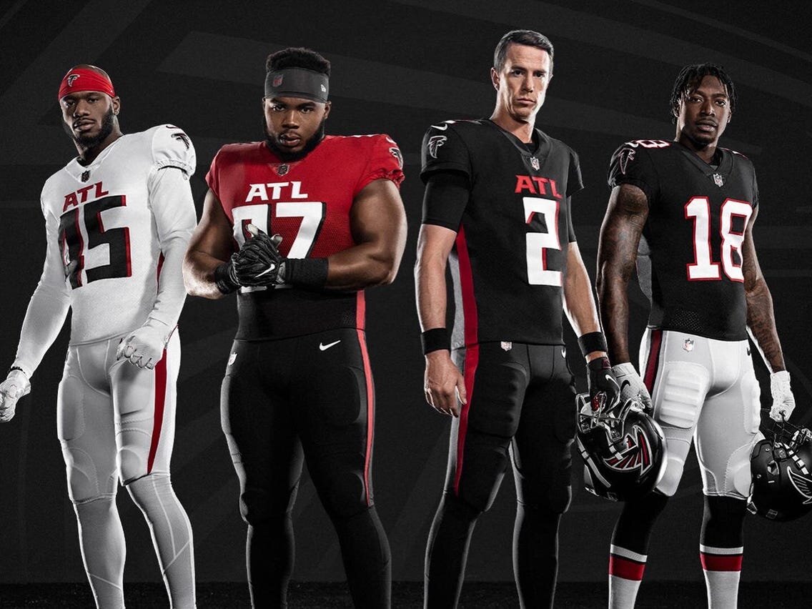
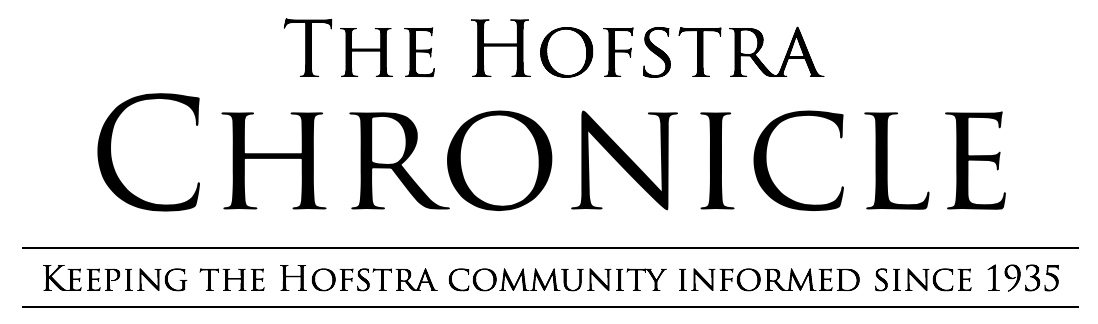
First thoughts: The Falcons have really impressed me here. Coming out of the gate with the all-black and all-white look is very sharp. As for the uniform itself, I think they have a much better representation of a falcon. The pointed stripe along the side and onto the pants gives me wing vibes. As for the obvious new edition, red fading to black, I love that the Falcons are trying something no team in the NFL has done before. In total, they have eight different uniform combinations to choose from on gameday.
Much like the Bucs, a new uniform is not the only thing the Falcons have to look forward to next year. After being cut from the Los Angeles Rams during the offseason, running back Todd Gurley was signed by the Atlanta Falcons to a $6 million one-year contract. For Gurley, this is a bit of a homecoming, as he played for the University of Georgia before entering the NFL draft in 2015. After signing, Gurley posted a picture on his official Instagram account with him in his new jersey and number.
I also think the Falcons made the right move with some minor details. For example, Atlanta will have black helmets with a bigger logo and a matte finish. I think bigger is the way to go, and with black home jerseys compared to the old red, it will match a lot better. The Falcons are set to play their fourth season in the Mercedes-Benz Stadium, and with this new sleek design, they deserve to be playing there.
Another thing to take a look at is the Atlanta abbreviation on the chest. ATL; great look here, similar to what we have seen in the NBA with the Atlanta Hawks. Atlanta is a community that definitely comes together to support their teams, so to put them front and center is fitting.
Morgan Shaw Parker, chief marketing officer for the Falcons, said of the new look, "This process has been a true reflection of Arthur Blank's core values – listening and responding to our fans. The city has evolved; our stadium has evolved and we knew it was time to do the same with our brand."
While evolving, the team still stayed true to their roots by keeping the traditional throwback uniforms that are a fan favorite. The look that was first worn in 1966 is now still in their rotation today.
Okay, okay, enough bird talk. Let’s get on to the review.
A new home color, a sharp away choice, a standout alternate and a nice representation of the city itself...
Tino’s rating: 7.9
A great score here. While I am in love with the bold alternates, we just don’t know how they will look when it comes to game time. Aside from that, I think the essence of a falcon itself is definitely there more than it was before. Maybe Falcons fans can use these new jerseys to cover up that 28-3 lead they had in the Super Bowl.
Photos courtesy of the Atlanta Falcons

