
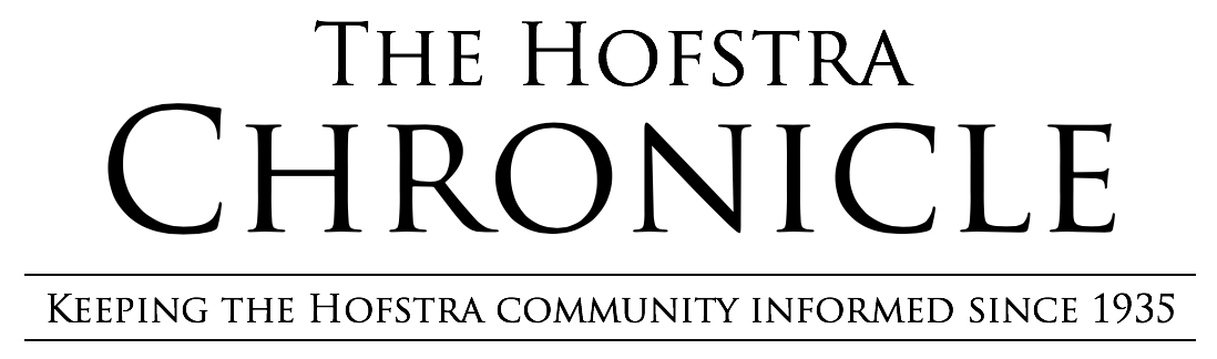
Tino's Jersey Reviews: Indianapolis Colts
Hello everyone! Welcome back to Tino’s Jersey Reviews!
In our previous review, we took a look at the Atlanta Falcons’ major upgrade for the 2020 NFL season. If you missed that one, go check it out! Now, we are going from the NFC South to the AFC South. Let’s review the Indianapolis Colts.
First thoughts
One word: Yikes. Now, when I decided to make this jersey review series, I did my research. Seven teams were said to release new uniforms for this NFL season coming up. Whether that means a new throwback, a different alternate or even whatever the Browns are going to do, the words “new” and “uniform” really are the content we’re looking for. And that is what I was expecting from the Colts.
I checked my phone to see that the Indianapolis Colts revealed their new upgraded threads, and I was excited. I watched a two-minute video only to be introduced to a new font and collar logo. Do you know what else I could have done in those two minutes? Made hot pockets, ran a mile, cured coronavirus – I personally felt my time was wasted. Those are two minutes I will never get back. From here on out, I have beef with the entire Colts organization for putting me through this review.
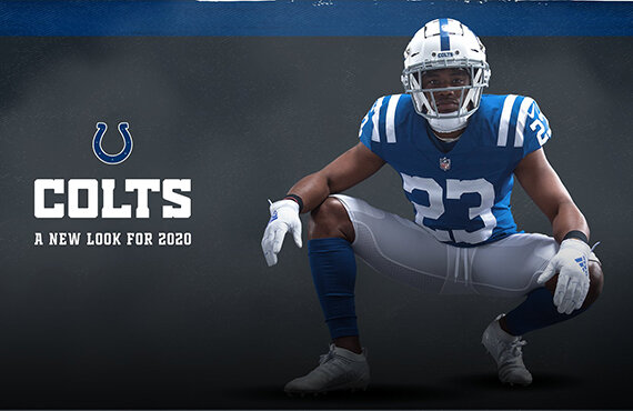
I mentioned an updated font, and here it is. I like this and I think it fits the team well. If you are a Colts fan, you may be hyped about the life-changing decision to squeeze down the block letter to make the team name readable without squinting.
Another thing that they changed is the numbers. They chose to go with a sharper cutout design to mirror the teams that played in the 1950s and 60s. I like the idea of respecting the past and incorporating it into their future. I do not know why they ever changed that, if I’m being honest.
The biggest change that the Colts are bringing to their uniforms now is the new “Indiana” logo. They were onto something here! I love how they incorporated the horseshoe into the new “C” –with the state of Indiana being represented throughout the center of it. But why create this and not incorporate it into the uniform in a way that can be seen? This could have been added on the top’s as a nice patch, or even as a replacement for the horseshoe on the helmets for a game or two. But the Colts choose to represent their home state by putting it on the players’ necks.
According to the Colts, "the new wordmark incorporates modern elements while embracing some of the design features from the traditional mark. With this new design, the traditional wordmark becomes a historic mark and will be used primarily for throwback campaigns and gear."
With Phillip Rivers ending his 15-year tenure with the San Diego/Los Angeles Chargers and coming into Indianapolis, I think the jersey changes are pretty much reflective of that. Playing it safe, and going back to what’s old.
Okay, okay. Enough with the horse talk. Let’s get on to the review.
Missed the opportunity to add blue pants, did not incorporate a nice new logo, slightly changed the font...
Tino’s rating: 2.1
The Colts have forever taken those two minutes of my life away by releasing a hype tape about font size. I guess I won’t be getting that time back, just like how they won’t be getting Andrew Luck back!
Photos Courtesy of the Indianapolis Colts

