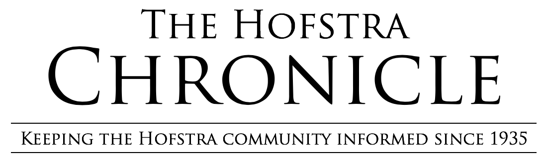
The cover for Charli XCX’s album “BRAT” is ugly; at least, it should be. The color is a putrid shade of green with the word “brat” typed in the center in slightly blurry text. Not much else is going on, but, this past summer, the album’s cover took on a life of its own, becoming the catalyst for “brat summer” and a cornerstone of 2024 pop culture. It was plastered all over the internet, on T-shirts, billboards and much more. Why is that? How did the cover for Charli’s latest album become so popular and recognizable overnight? Well, it boils down to a few key components.
Firstly, the cover is simple. An album cover does not have to be detailed to be iconic. In fact, simplicity in cover art can make it more recognizable. This can be seen in covers like Pink Floyd’s “The Dark Side of the Moon” and Joy Division’s “Unknown Pleasures.” People who have never heard any songs from either of these bands are likely to recognize the art associated with them. In the case of “BRAT,” the cover is so barebone that it is far easier to remember than covers with more details.
The cover has a unique advantage: memeability. The simplicity of the cover makes it very easy to convey a message. Seeing the traction the cover started to gain, Charli and her team came up with the “brat generator.” This allowed fans to type in anything they wanted in the format of the album cover. This spawned countless memes and posts across social media that were clad in the neon green and grainy Arial font. Because of how accessible the “brat generator” was and the user-friendly format, parodies of the cover quickly took off.
Another huge component to the cover’s virality is the green color. This distinct shade of green stuck with those who listened to the project or simply saw the cover, and after it blew up in popularity, everything that was a similar color to the cover was “brat coded.” From road signs to stickers and everything in between, the “BRAT” comparisons became a running joke on the internet.
These memes and jokes can be seen in TikToks such as one that compared “BRAT” with Weezer’s third album (the “Green Album”), joking that “I figured out the real brat color code.” This color was so bold and recognizable that it became synonymous with the album.
The color is partly the reason why this cover works: it is bold. The audacious nature of the art fits perfectly with the themes of Charli’s album: confidence and brashness, as well as being messy and in-your-face. Charli wanted the cover to make a statement.
In an interview with Billboard, Charli shared that the cover “had to be untrendy and uncool, cause there’s nothing worse than vibes, you know?”
She wanted it to stick out like a sore thumb, spark conversation and make the audience think about why they may or may not like it.
“Brat summer” etched its place in pop culture history, thanks significantly to the cover of the album. The shirts, memes, advertisements and other memorable content sparked by this ugly square will be remembered as an essential role in 2024’s cultural landscape. Thanks to the combination of boldness and the themes of the album, as well as its propensity to becoming a meme and good marketing decisions, it was launched into the stratosphere.


